I believe that the edited version of this photograph looks cool with a black and white theme, but I think the theme makes it so that the dirt on the step does not stand out as much. Plus, the blurred colour in the background looks better.
I believe that the black and white theme is very effective and is a great improvement from the original photograph as the black is a good contrast to the white net pattern of the racket making it stand out.
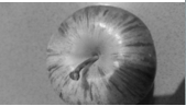
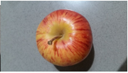
I believe that the original photograph looks better than the edited black and white themed one as with the colourful one the vibrant colours of the apple create a nice pattern and texture whilst the black and white theme makes this harder to see.
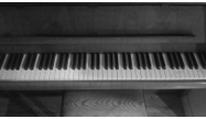
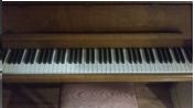
I believe that both, the original and the edited photograph look good, but I think that the black and white theme is very effective and gives this piece a very cool effect where it looks very old (which also makes the white piano keys stand out more).
The main point of the moving the camera to blur to vibrant colours and make it stand out was to make the colours burst out at you but with the black and white theme it is not very effective and just ruins it.
I believe that the edited black and white version stands out compared to the original and it is very effective. The black theme contrasts with the white colour under the peeled paint and makes it stand out, creating a very cool pattern.
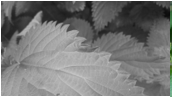
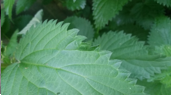
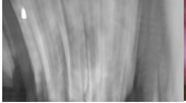
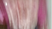
I think that the edited version of the photograph look better than the original as no blur is being used so it doesn’t ruin it and it is very effective in making the sides of the plant stand out.
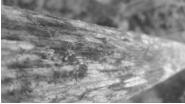
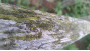
I believe that the original photograph looks better because it allows you the see they texture of the moss growing on the wooden post which you cannot properly identify on the edited version.
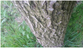
I think that the edited version is effective here as the black and white theme works well with the brown and green of the original and gives a cool dark pattern of the bark on the tree.
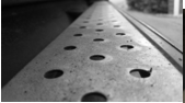
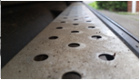
I think that both photos, original and edited look great here but the black and white theme work well with the here and create an effective image that’s shows a cool pattern.
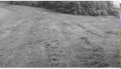
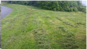
I believe that the original looks better than the edited version here as on the black and white themed one you cannot easily identify the mounds of grass built up on thus not see the pattern but on the colour one you can.
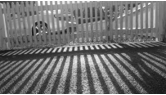
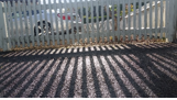
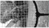
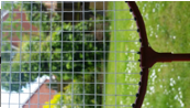
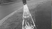
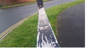
I think that the edited version works well here and makes the image look old which only emphasizes the cool effect and makes the pattern of the fence and its shadow stand out.
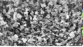
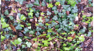
I think that the edited version of this does not work because the reason that the image looks so good is because the vibrant colours of all the leaves are creating a cool pattern but with the black and white version it ruins this.
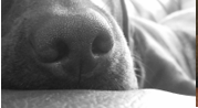
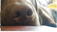
I think that this image works well with colour and black ad white, but the black and white theme looks better as it emphasizes the texture of the dog’s nose.
