Personal response to the brief

Aaron Siskind

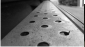
In Aaron Siskind’s work he uses a lot of black and white theme (primarily to make things look old and worn down – peeling paint on wall) and close shots. He likes to show things decaying and breaking down (peeling paint, decaying bricks, posters being scratched etc. For example:

12

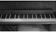
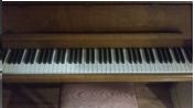
This is Siskind’s work where he used this black and white effect to make the poster look scratched and make the brick wall look like its decaying, but to also give it a rough texture to it. I attempted to copy and recreate this effect in my own work:

34

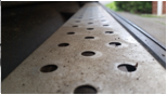
Where I used this effect to make my image look old (dirty and old running board and an old piano).

Freeman Patterson

In Patterson’s work he likes to experiment with bright and vibrant colours and one of the main effects that is recursive in his work is the use of the blur effect (mainly by moving/shaking the camera before it takes the shot) to blur the entire image and make the bright and vibrant colours burst out at the observer. This effect gives the image a very cool pattern. In addition to this he takes very good photographs at the right time. For example:

56

I attempted to recreate Patterson’s use of this effect, as shown in:

78

Where I repeated the effect by moving my camera at the last second and it proved to be very successful.

William Neill

In William Neil’s work he likes to use a bit of everything (reflection in water, black and white theme etc.) as shown in:

910

Where he uses the reflection to show the ripple pattern in the water with the trunks of the trees sprouting out of the water as well. And where he uses the black and white theme effectively to create a cool pattern of leaves. I attempted to recreate this effect in my own work shown in:

1112

Where I used the water to make the peeling of the paint on the sign stand out. In addition to this the black and white effect contrasts with the white colour shown when the paint start to peel.
Modified Photographs

12

I believe that the edited version of this photograph looks cool with a black and white theme, but I think the theme makes it so that the dirt on the step does not stand out as much. Plus, the blurred colour in the background looks better.

34

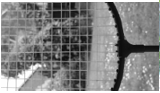
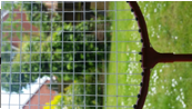
I believe that the black and white theme is very effective and is a great improvement from the original photograph as the black is a good contrast to the white net pattern of the racket making it stand out.

56

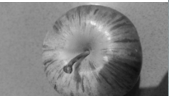
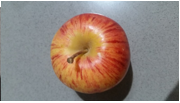
I believe that the original photograph looks better than the edited black and white themed one as with the colourful one the vibrant colours of the apple create a nice pattern and texture whilst the black and white theme makes this harder to see.

78

I believe that both, the original and the edited photograph look good, but I think that the black and white theme is very effective and gives this piece a very cool effect where it looks very old (which also makes the white piano keys stand out more).

910

The main point of the moving the camera to blur to vibrant colours and make it stand out was to make the colours burst out at you but with the black and white theme it is not very effective and just ruins it.

1112

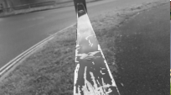
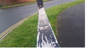
I believe that the edited black and white version stands out compared to the original and it is very effective. The black theme contrasts with the white colour under the peeled paint and makes it stand out, creating a very cool pattern.

1314

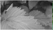
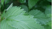
I think that the edited version of the photograph look better than the original as no blur is being used so it doesn’t ruin it and it is very effective in making the sides of the plant stand out.

1516

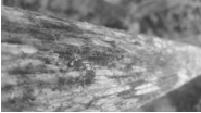
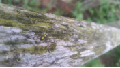
I believe that the original photograph looks better because it allows you the see they texture of the moss growing on the wooden post which you cannot properly identify on the edited version.

1718

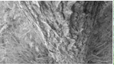
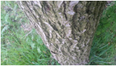
I think that the edited version is effective here as the black and white theme works well with the brown and green of the original and gives a cool dark pattern of the bark on the tree.

1920

I think that both photos, original and edited look great here but the black and white theme work well with the here and create an effective image that’s shows a cool pattern.

2122

I believe that the original looks better than the edited version here as on the black and white themed one you cannot easily identify the mounds of grass built up on thus not see the pattern but on the colour one you can.

2324

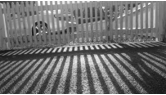
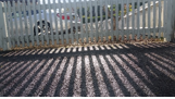
I think that the edited version works well here and makes the image look old which only emphasizes the cool effect and makes the pattern of the fence and its shadow stand out.

2526

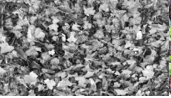
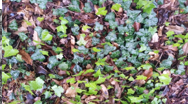
I think that the edited version of this does not work because the reason that the image looks so good is because the vibrant colours of all the leaves are creating a cool pattern but with the black and white version it ruins this.

2728

I think that this image works well with colour and black ad white, but the black and white theme looks better as it emphasizes the texture of the dog’s nose.